Art of films:Waking up Sleeping Beauty (1959)
I remember one of my lecturers said that film is the seventh sister of the arts,combining every art known.Basically this little column focused on how art history was incorporated to the world of film.
Today I will gave myself the most difficult task ever in my film geeking history,revisting a childhood fairytale “Sleeping Beauty.” There are so many people who grew up watching Disney animated features,perhaps this beauty was perhaps a staple of our childhood. Here it is not only radical,visually but also in story-telling. Here I would be focusing on the art of Sleeping Beauty and how it incorporates art history to its animation style.

For some background history on the production of sleeping beauty-basically Disney have some triumphs with the release of Snow White (1937) as the first animation feature-length film and during the early 50’s Cinderella (1951) did extremely well on the box offices. Subsequently Disney released more animated films but not as well-received as Cinderella like Alice in Wonderland (1951) or Lady and The Tramp (1955). In addition Walt Disney way too focused on Disneyland,so he neglected the animation department.According to the Perfect Picture-Sleeping Beauty, Disney thought how to make it very different from his previous fairytale blockbusters. Well first the story was way different as there are no sub-plots for the minor characters or lots of humour. However what it makes it so different is perhaps its animation style that is such a marvel for today whenever you are an animation buff or a casual viewer.
During that period,illustration and design have gone to more stylized with its block-like shape and limited colour palette. So it looks something like this


Now Walt thought of applying that same philosophy as one commented that “Sleeping Beauty seems to be that response to that question in a feature film.” So the look of Sleeping Beauty leans to be “More designee, more sopishcated and more decorative.” as seen in a concept art by Eyvrid Eale. (I would be mentioning about his works very soon)
Interestingly Walt mentioned that his concept was ‘moving illustrations“,So if you paused a frame in Sleeping Beauty on your DVD player,well it’s basically look well-composed illustration itself. (I suggest you try it and let me know). Here is a Blu-Ray example of what I am talking about

So John Hinges (The layout artist) visited the Cloisters (Metropolitan Museum of art branch dedicated to Medieval art) and saw this piece that will inspire the look of Sleeping Beauty and emulates Disney’s vision to life.

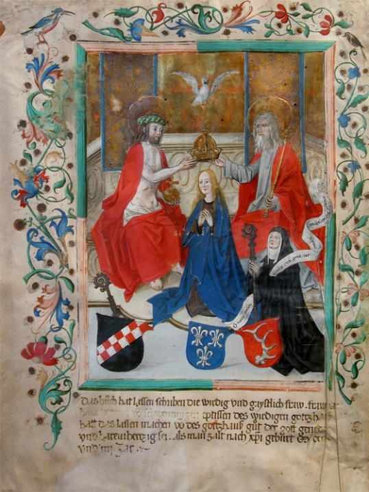
Ta-da! The Unicorn tapestery and there they got their inspiration from of course Medieval and Gothic Paintings and manuscripts
And some as far as Persian Minitaures
Extremely detailed backgrounds (well it takes the background painters 8-10 days during the production of Sleeping beauty to finish 1 background of Sleeping Beauty)

Jewel-Like Tones

Block-like designs which is in trend during the late 50’s (Fun Fact:Eyrind Earle did these detailed manuscripts like paintings in a specially made book for the prolouge and ending)

The original book

Even the costumes are slightly inspired to Sleeping Beauty
This is the closest we can get to Sleeping Beauty. (Aurora’s costume)
This is a page called “The Book of Hours” which is an instruction manual for harverst and I found a similar homage to Earale’s concept art.

Another fun fact again,in a commentary by Disney animators John Lassiter,Andreas Deja and Leonard Maltin. The character designs of the goons (A.K.A Malecifent’s evil sidekicks) are based on the creatures in the painting called The Temptation of St Anthony (1505-1506)
Basically the design team did borrow some inspiration from Renassicene paintings too. Now you need a dream team to executed the intricate nature of these paintings let’s focus on the man who created the most beautiful backgrounds for Sleeping Beauty:Eyvind Earle.
One commented that Earle “was a quiet man,almost private”. Despite Walt’s immersive support for his art direction-the animators would say otherwise and they are totally against his style. Even in the revival of Disney animation in the 1973 at the Lincoln Center-Frank Thomas attacked Earle publicly. However that backlash from his fellow Disney animators who called his art direction too ‘Austere” does not hurt Earle because he perhaps created the dream Walt wanted. He managed to fused his unique abstract block-like style with the influences of Medieval and Gothic paintings beautifully.


Now compare to the concept art/backgrounds for Sleeping Beauty,it looks strong and graphic as opposed to the more romantic and gentler art directions of the past two Disney films.


Now I would do a rundown of the most iconic and famous scenes of Sleeping Beauty
Once Upon A Dream
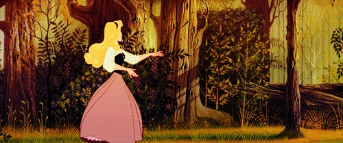
Well this song may be called Once Upon a Dream,where Prince Philip meets Aurora for the first time in 16 years. It was an animation nightmare for the animators itself. It took 4 times just to reanimate that scene it almost make the company gone bankrupt and lots of heated arguments filled teh animation room. Burny Mattiniston (The animator of Malecificent) once recounted on the approval from Walt himself during an interview with Animated Views-“it’s the first scene done to see if the animation would work with Eyvind’s backgrounds and it was critical to Walt to see if this approach would work…and the fact that I had to redo it so many times. Marc took me to a local restaurant and gave me a cake saying ‘Happy 31′ when Walt okayed it for final color!” It was that eye of detail that makes Sleeping Beauty such a success in the animation department. I recommend that you should watch this feauturette-“Scene 8” which talks in depth on the animation sequences of Once Upon A Dream and the problems during that well-loved sequence.
Now to the analysis,in contrast to the extremely intricate backgrounds of Earale which echoed the influences of The Persian Miniatures and Gothic paintings. The character design of Sleeping Beauty was sleek and elegant-like. It is no surprise that Aurora was inspired by Audrey Hepburn!

Of course we also see the jewel-like tones as seen in Phillip’s cape. It adds that modern edge that is so co-linked with the current period. To me the red could stand the strength and it echoes Aurora’s pink/blue dress.

It was beautiful to look at and personally I feel it was worthwhile that these animators spend hours and days just making that extremely beautiful and perhaps well-loved sequence of that film. Here is a live-action reference of that dance sequence of Aurora
In contrast to the serene (Yet nightmare sequence for the animators then) Once Upon A Dream, as John Lasstasser commented the climax sequence as “the scene that scares the heck out of kids,a spectulaer ending and makes use of the new screen format” By the way the screen format he talks about,Sleeping Beauty was filmed in 70mm (Previous films filmed in that format are Lawrence of Arabia,Ben-Hur and Kubrick 2001-A Space Odyssey)
Perhaps it was perhaps the most awe-inspiring scenes in Sleeping Beauty. The use of purples,yellows and blues are absolutely fitting as the colours of evil and darkness and it seems that it leans more to the illustration-like nature by the block-like designs like the scene of Prince Philip going through the forest of thorns. as opposed to the extremely detailed backgrounds we seen in Once Upon A Dream .It feels like an illustration comes to life before your eyes.
The Animator of Maleficent’s dragon form was inspired by the movements of a rattlesnake and you see the live action reference video I put in on the photo recreation of the battle sequence, you see the dodging back and forth like a snake. It was that sheer amount of that detail that Disney painted special attention that makes the most frightening scene ever in Sleeping Beauty.
After a decade in production-Sleeping Beauty opened on 10 January 1959 and it actually did well in the box offices,making it the first grossing film next to Ben-Hur (1959). However it leads to detrimental results for this gamble as Disney slowly swapped its to Xerox software (We will see prominently later in 101 Dalmatians and The Jungle Book) in the 1960’s and there will no more animation fairytales till The Little Mermaid (1989). It nearly bankrupt the Disney company eventually.
However it was all worth it as it inspired so many young animators to take up the quality of Sleeping Beauty into their films. Many admired Earle’s stylized art direction and of course creates so many memorable sequences that was etched to many minds. Recently Tangled (2010) wanted to hark back the old days of Sleeping Beauty.

To conclude of my really extremely ambitious post I shall put a quote by John Canemaker. As commented at the beginning of the documentary “Perfect Picture-The Making of Sleeping Beauty.”-“It is the end of the era,the end of animation,we will never seen this opulence again,the lavishness and the meticulous craftsmanship that is gone.” Yes this type and scale of animation may not been seen again in today’s animation films. However there is hope that many generations would watch Sleeping Beauty and do appreciate the boundaries of animation they have reached today.
I would like to thank my sister,she was previously studied animation to let me to take the challenge of analyzing our childhood film with fresh eyes. I admit it was tough to find essays or information for that film on the net online. I have lots of fun rediscovering that classic and when I rented my DVD of Sleeping Beauty. I just want to pause the DVD and admire how beautiful it was.


